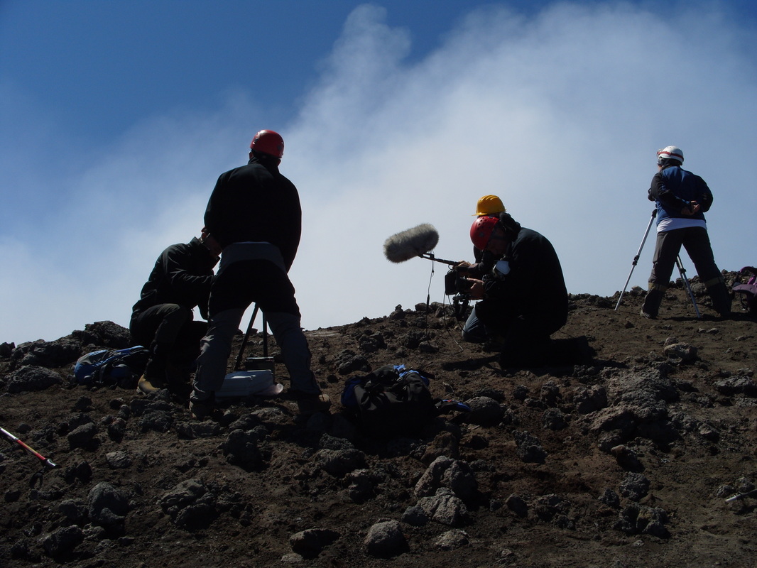
 I was very lucky that I started my PhD with a large amount of data collected during the summer of 2012. Whilst I was at Mt. Etna in July I was fortunate (I think) to witness the filming of a Discovery Channel episode called - 'Volcano Time Bomb' which was aired in December 2012. I was volunteered to help carry camera equipment up and down from the summit...(for two very nice guys I should add) It was certainly an eye-opener to the filming of these documentaries. Everything had a tendency towards the dramatic! Epic walking up steep slopes, sweating profusely, slamming of Jeep doors, occasionally with multiple takes - just to make sure everything looked impressive. It should definitely be noted that while all this was going on there was actually some good science taking place! p.s. I didn't look at the credits but I hope I got a mention! 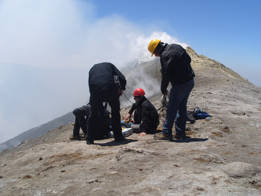
Currently, a lot of my work is involved with looking at correlations between various geo-chemical and geophysical signals. Some of these produce very colourful images anyway, but especially so if you make a mistake! This was produced in Matlab. Let me know what you think! Certainly better than some of the artwork you can see, perhaps I will make millions... 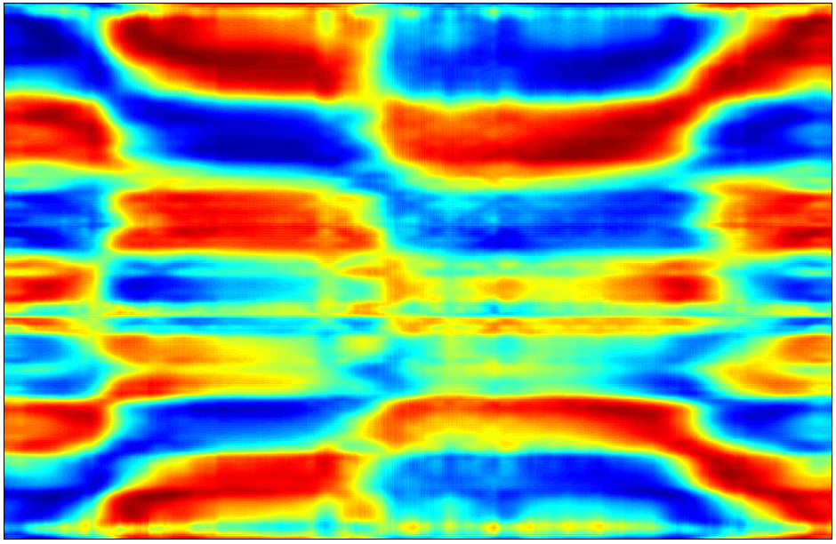
YouTube is a great tool if used correctly, but you can find some utter nonsense! I usually try to avoid posting on this kind of thing, however, this video actually confused me greatly and annoyed me as well. Please don't watch it all, it is nine minutes long, watch just a little and you will get the jist. The author states the following in her description: flashing lines may or may not be seismic monitoring signals, haarp, infrasound, or something else, but they appear to connect to earthquakes on this static google map. Probably a plug in designed to pick up signals or to monitor weather, i.e., eqs, seismic movements.. The google portion of this report is not verified or confirmed as factual, this is only a investigation and observation. To cut a long video very short. The author assumes that these lines flashing up on Google Maps/Earth (whenever the author moves the map) are somehow linked to recent earthquakes and/or a sink-hole because a line may randomly cross a recent earthquake event. They are obviously not. I am no graphics expert, but it seems quite obvious that they are the result of loading or redrawing of the map as it is moved. At which point do we jump to seismic signals, infrasound or Haarp?! In science the principle of parsimony is often referred to: if there are many theories the simplest should be preferred. This is definitely the case here.
The only factual part of this report is that there was a 3.2 earthquake in the Yellowstone area (not really that unusual by the way). Please please please tell me this was an early April Fools joke, unfortunately I don't think it was. |
 Archives
July 2023
|
 RSS Feed